Pandas DataFrame - plot.barh() function
A bar plot (or bar chart) is a graph that presents categorical data with rectangular bars with heights or lengths proportional to the values that they represent. The bars can be plotted vertically or horizontally.
The DataFrame.plot.barh() functions makes a horizontal bar plot. A bar plot shows comparisons among discrete categories. One axis of the plot shows the specific categories being compared, and the other axis represents a measured value.
Syntax
DataFrame.plot.barh(x=None, y=None, color)
Parameters
x |
Optional. Specify label or position. Allows plotting of one column versus another. If not specified, the index of the DataFrame is used. |
y |
Optional. Specify label or position. Allows plotting of one column versus another. If not specified, all numerical columns are used. |
colors |
Optional. Specify color for each of the DataFrame’s columns as str, array-like, or dict. Possible values are:
|
Return Value
Returns matplotlib.axes.Axes or an ndarray with one matplotlib.axes.Axes per column when subplots=True.
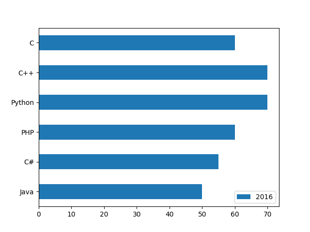
Example: horizontal bar plot on single column
In the example below, a DataFrame NumberOfStudents is created. A horizontal bar plot is created containing information about number of student studying different languages for year 2016.
import pandas as pd
import numpy as np
import matplotlib.pyplot as plt

NumberOfStudents = pd.DataFrame({
  "2016": [50, 55, 60, 70, 70, 60],
  "2017": [60, 65, 70, 80, 65, 55],
  "2018": [50, 65, 75, 100, 70, 60]},
  index= ["Java", "C#", "PHP", "Python", "C++", "C"]
)

#displaying the DataFrame
print(NumberOfStudents,"\n")
#creating the plot
NumberOfStudents.plot.barh(y=['2016'])

#displaying the plot
plt.show()
The output of the above code will be:
        2016  2017  2018
Java      50    60    50
C#        55    65    65
PHP       60    70    75
Python    70    80   100
C++       70    65    70
C         60    55    60
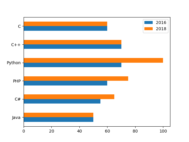
Example: horizontal bar plot on multiple columns
In the example below the horizontal bar plot is drawn for specified columns (2016, 2018).
import pandas as pd
import numpy as np
import matplotlib.pyplot as plt

NumberOfStudents = pd.DataFrame({
  "2016": [50, 55, 60, 70, 70, 60],
  "2017": [60, 65, 70, 80, 65, 55],
  "2018": [50, 65, 75, 100, 70, 60]},
  index= ["Java", "C#", "PHP", "Python", "C++", "C"]
)

#displaying the DataFrame
print(NumberOfStudents,"\n")
#creating the plot
NumberOfStudents.plot.barh(y = ['2016', '2018'])

#displaying the plot
plt.show()
The output of the above code will be:
        2016  2017  2018
Java      50    60    50
C#        55    65    65
PHP       60    70    75
Python    70    80   100
C++       70    65    70
C         60    55    60
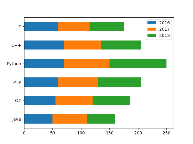
Example: stacked horizontal bar plot
By using stacked=True parameter, a stack horizontal bar plot can be created. Consider the example below:
import pandas as pd
import numpy as np
import matplotlib.pyplot as plt

NumberOfStudents = pd.DataFrame({
  "2016": [50, 55, 60, 70, 70, 60],
  "2017": [60, 65, 70, 80, 65, 55],
  "2018": [50, 65, 75, 100, 70, 60]},
  index= ["Java", "C#", "PHP", "Python", "C++", "C"]
)

#displaying the DataFrame
print(NumberOfStudents,"\n")
#creating the plot
NumberOfStudents.plot.barh(stacked=True)

#displaying the plot
plt.show()
The output of the above code will be:
        2016  2017  2018
Java      50    60    50
C#        55    65    65
PHP       60    70    75
Python    70    80   100
C++       70    65    70
C         60    55    60
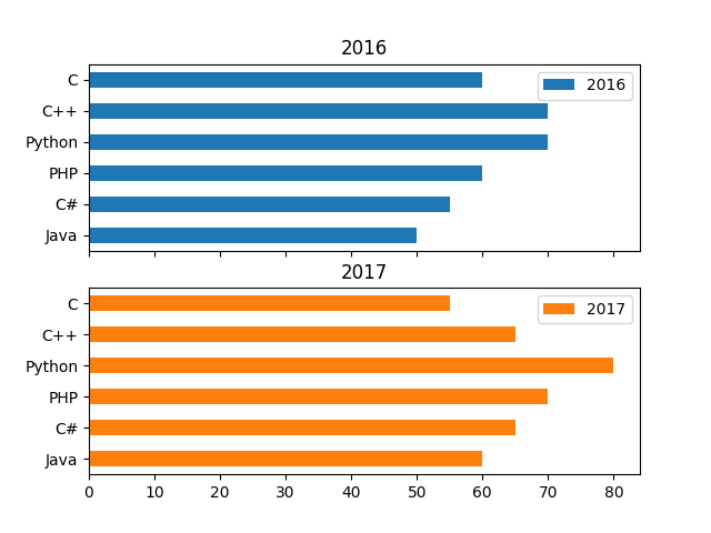
Example: splitting the plots column wise
By using subplots=True parameter, we can split the plots column wise. Consider the example below:
import pandas as pd
import numpy as np
import matplotlib.pyplot as plt

NumberOfStudents = pd.DataFrame({
  "2016": [50, 55, 60, 70, 70, 60],
  "2017": [60, 65, 70, 80, 65, 55],
  "2018": [50, 65, 75, 100, 70, 60]},
  index= ["Java", "C#", "PHP", "Python", "C++", "C"]
)

#displaying the DataFrame
print(NumberOfStudents,"\n")
#creating the plot
NumberOfStudents.plot.barh(y=['2016','2017'],
                           subplots=True)

#displaying the plot
plt.show()
The output of the above code will be:
        2016  2017  2018
Java      50    60    50
C#        55    65    65
PHP       60    70    75
Python    70    80   100
C++       70    65    70
C         60    55    60
❮ Pandas DataFrame - Functions
