Matplotlib - Axes Class
Axes object is the region of the image with the data space. A given figure can contain many Axes, but a given Axes object can only be in one Figure. With the help of axes, one can plot at any location in the Figure. Hence, it provides flexibility to create sub-plots. It is a state-based interface (pyplot module) in Matplotlib Library.
The Axes object is added to a Figure object by calling the add_axes() function. It requires a list containing four elements representing left, bottom, width and height receptively of the figure. Each element must be between 0 and 1.
axes() Function
To create an axes the axes() function of the pyplot module is used in the matplotlib library. The syntax for using this function is given below:
class matplotlib.axes.Axes(fig, rect)
Parameters
fig |
Required. The axes is build in the Figure fig. |
rect |
Required. The axes is build in the rectangle rect rect is in Figure coordinates. It is specified as [left, bottom, width, height]. Each element must be between 0 and 1. |
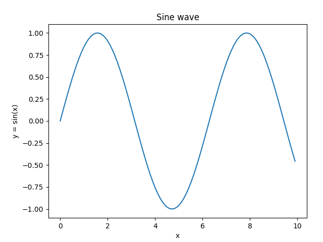
Example: axes example
The example below shows the usage of axes() function.
import matplotlib.pyplot as plt
import numpy as np

#creating an array of values between
#0 to 10 with a difference of 0.1
x = np.arange(0, 10, 0.1)
y = np.sin(x)

#creating figure object
fig = plt.figure()
#creating axes object
ax = plt.axes([0.15,0.1,0.8,0.8])

#formatting axes
ax.set_title("Sine wave")
ax.set_xlabel("x")
ax.set_ylabel("y = sin(x)")

#drawing the plot
ax.plot(x, y)

#displaying the figure
plt.show()
The output of the above code will be:
add_axes() Function
The add_axes() function is used to add an Axes object to a Figure object. The syntax for using this function is given below:
Figure.add_axes(rect)
Parameters
rect |
Required. The axes is build in the rectangle rect rect is in Figure coordinates. It is specified as [left, bottom, width, height]. Each element must be between 0 and 1. |
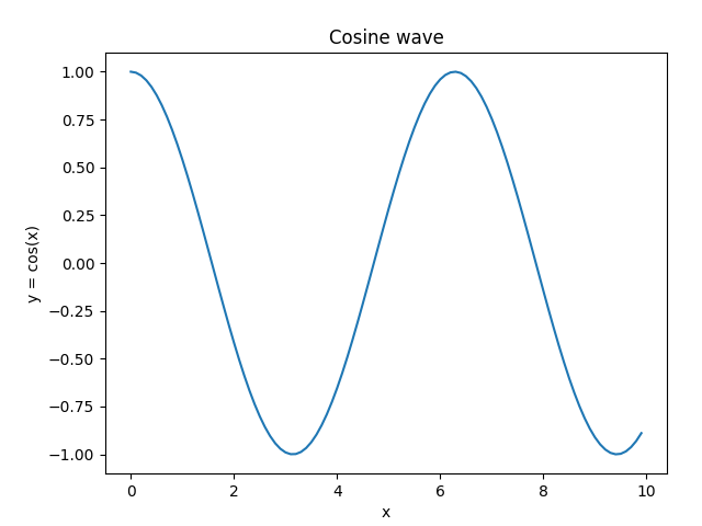
Example: adding Axes object
The example below shows the usage of axes() function.
import matplotlib.pyplot as plt
import numpy as np

#creating an array of values between
#0 to 10 with a difference of 0.1
x = np.arange(0, 10, 0.1)
y = np.cos(x)

#creating figure object
fig = plt.figure()
#adding axes object to the figure object
ax = fig.add_axes([0.15,0.1,0.8,0.8])

#formatting axes
ax.set_title("Cosine wave")
ax.set_xlabel("x")
ax.set_ylabel("y = cos(x)")

#drawing the plot
ax.plot(x, y)

#displaying the figure
plt.show()
The output of the above code will be:
Axes.legend() Function
For setting legend, the Axes.legend() function is used.
Syntax
#sets a title for the Axes
Axes.legend(self, *args, **kwargs)
The call signatures are:
#Automatic detection of elements for legend
legend()

#Labeling existing plot elements
legend(labels)

#Explicitly defining the elements for legend
legend(handles, labels)
Along with this, the location of the legend can be specified using loc parameter. It can take value from the table below:
| Location String | Location Code |
|---|---|
| 'best' | 0 |
| 'upper right' | 1 |
| 'upper left' | 2 |
| 'lower left' | 3 |
| 'lower right' | 4 |
| 'right' | 5 |
| 'center left' | 6 |
| 'center right' | 7 |
| 'lower center' | 8 |
| 'upper center' | 9 |
| 'center' | 10 |
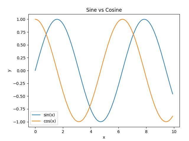
Example: adding legends
In the example below, the axes legend is set using legend(labels) calling signature.
import matplotlib.pyplot as plt
import numpy as np

#creating an array of values between
#0 to 10 with a difference of 0.1
x = np.arange(0, 10, 0.1)
y1 = np.sin(x)
y2 = np.cos(x)

#creating figure object
fig = plt.figure()
#adding axes object to the figure object
ax = fig.add_axes([0.15,0.1,0.8,0.8])

#plotting curves
ax.plot(x, y1)
ax.plot(x, y2)

#formatting axes
ax.set_xlabel("x")
ax.set_ylabel("y")
ax.set_title("Sine vs Cosine")

#adding legend
ax.legend(['sin(x)', 'cos(x)'], loc=0)

#displaying the figure
plt.show()
The output of the above code will be:
Axes.plot() Function
This is the basic method of axes class that plots values of one array versus another as lines or markers. The plot() method can have an optional format string argument to specify color, style and size of line and marker.
Format String
A format string consists of a part for color, marker and line:
fmt = '[marker][line][color]'
Each of them is optional. If not provided, the value from the style cycle is used. Other combinations such as [color][marker][line] are also supported, but note that their parsing may be ambiguous.
A format string can be added to a plot to add more styles in it.
Markers
| Character | Description |
|---|---|
| '.' | point marker |
| ',' | pixel marker |
| 'o' | circle marker |
| 'v' | triangle_down marker |
| '^' | triangle_up marker |
| '<' | triangle_left marker |
| '>' | triangle_right marker |
| '1' | tri_down marker |
| '2' | tri_up marker |
| '3' | tri_left marker |
| '4' | tri_right marker |
| '8' | octagon marker |
| 's' | square marker |
| 'p' | pentagon marker |
| 'P' | plus (filled) marker |
| '*' | star marker |
| 'h' | hexagon1 marker |
| 'H' | hexagon2 marker |
| '+' | plus marker |
| 'x' | x marker |
| 'X' | x (filled) marker |
| 'D' | diamond marker |
| 'd' | thin_diamond marker |
| '|' | vline marker |
| '_' | hline marker |
Line styles
| Character | Description |
|---|---|
| '-' | solid line style |
| '--' | dashed line style |
| '-.' | dash-dot line style |
| ':' | dotted line style |
Colors
| Character | Description |
|---|---|
| 'b' | blue |
| 'g' | green |
| 'r' | red |
| 'c' | cyan |
| 'm' | magenta |
| 'y' | yellow |
| 'k' | black |
| 'w' | white |
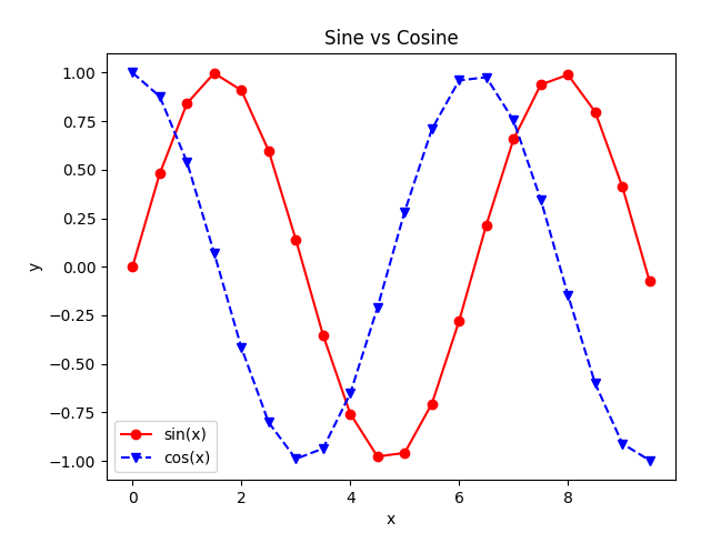
Example: using format string
In the example below, format string is used to add more styles in the plot.
import matplotlib.pyplot as plt
import numpy as np

#creating an array of values between
#0 to 10 with a difference of 0.5
x = np.arange(0, 10, 0.5)
y1 = np.sin(x)
y2 = np.cos(x)

#creating figure object
fig = plt.figure()
#adding axes object to the figure object
ax = fig.add_axes([0.15,0.1,0.8,0.8])

#plotting curves
ax.plot(x, y1, 'o-r')
ax.plot(x, y2, 'v--b')

#formatting axes
ax.set_xlabel("x")
ax.set_ylabel("y")
ax.set_title("Sine vs Cosine")

#adding legend
ax.legend(['sin(x)', 'cos(x)'], loc=0)

#displaying the figure
plt.show()
The output of the above code will be: