Matplotlib - Line Plot
A line plot or line chart is a type of chart which displays information as a series of data points connected by straight line segments. It is similar to a scatter plot except that the measurement points are ordered (usually by x-axis value) and joined with straight line segments. A line plot is often used to visualize a trend in the data.
The Matplotlib plot() function makes a line graph of y vs x.
#single set of data
plot([x], y, [fmt])

#multiple sets of data
plot([x], y, [fmt], [x2], y2, [fmt2])
The coordinates of the points or line nodes are given by x, y. The optional parameter fmt is a convenient way for defining basic formatting like color, marker and line style. Few common way of calling this function is given below:
plot(x,y)       #plot x and y using default line style and color
plot(x,y,'bo')  #plot x and y using blue circle markers
plot(y)         #plot y using x as index array 0..N-1
plot(y,'r+')    #plot y using x as index array 0..N-1 with red pluses
Example: line plot using single set of data
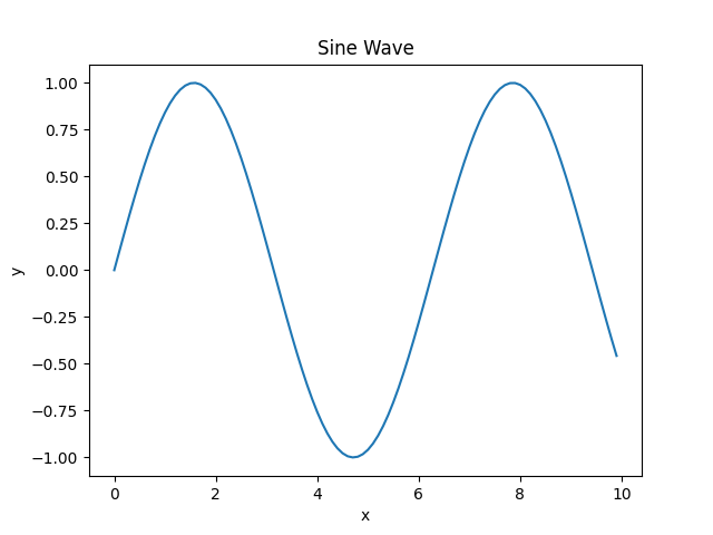
In the example below, the plot() function is used to plot y = sin(x).
import matplotlib.pyplot as plt
import numpy as np

#creating an array of values between
#0 to 10 with a difference of 0.1
x = np.arange(0, 10, 0.1)
y = np.sin(x)

#creating figure and axes object
fig, ax = plt.subplots()

#plotting the curve
ax.plot(x, y)

#formatting axes
ax.set_xlabel("x")
ax.set_ylabel("y")
ax.set_title("Sine Wave")

#displaying the figure
plt.show()
The output of the above code will be:
Example: line plot using multiple sets of data
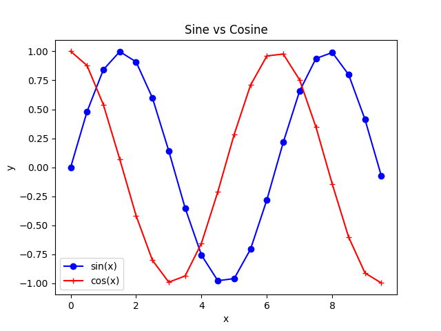
Consider one more example where plot() function is used for multiple sets of data on a given axes.
import matplotlib.pyplot as plt
import numpy as np

#creating an array of values between
#0 to 10 with a difference of 0.5
x = np.arange(0, 10, 0.5)
y1 = np.sin(x)
y2 = np.cos(x)

#creating figure and axes object
fig, ax = plt.subplots()

#plotting curves
ax.plot(x, y1, 'bo-', x, y2, 'r+-')

#formatting axes
ax.set_xlabel("x")
ax.set_ylabel("y")
ax.set_title("Sine vs Cosine")

#adding legend
ax.legend(['sin(x)', 'cos(x)'])

#displaying the figure
plt.show()
The output of the above code will be:
Example: line width and marker size
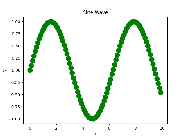
The linewidth and markersize are used to customize the line width and maker size respectively. Consider the example below:
import matplotlib.pyplot as plt
import numpy as np

#creating an array of values between
#0 to 10 with a difference of 0.1
x = np.arange(0, 10, 0.1)
y = np.sin(x)

#creating figure and axes object
fig, ax = plt.subplots()

#plotting the curve
ax.plot(x, y, 'go--', linewidth=2, markersize=12)

#formatting axes
ax.set_xlabel("x")
ax.set_ylabel("y")
ax.set_title("Sine Wave")

#displaying the figure
plt.show()
The output of the above code will be:
Format String
A format string consists of a part for color, marker and line:
fmt = '[marker][line][color]'
Each of them is optional. If not provided, the value from the style cycle is used. Other combinations such as [color][marker][line] are also supported, but note that their parsing may be ambiguous.
A format string can be added to a plot to add more styles in it.
Markers
| Character | Description |
|---|---|
| '.' | point marker |
| ',' | pixel marker |
| 'o' | circle marker |
| 'v' | triangle_down marker |
| '^' | triangle_up marker |
| '<' | triangle_left marker |
| '>' | triangle_right marker |
| '1' | tri_down marker |
| '2' | tri_up marker |
| '3' | tri_left marker |
| '4' | tri_right marker |
| '8' | octagon marker |
| 's' | square marker |
| 'p' | pentagon marker |
| 'P' | plus (filled) marker |
| '*' | star marker |
| 'h' | hexagon1 marker |
| 'H' | hexagon2 marker |
| '+' | plus marker |
| 'x' | x marker |
| 'X' | x (filled) marker |
| 'D' | diamond marker |
| 'd' | thin_diamond marker |
| '|' | vline marker |
| '_' | hline marker |
Line styles
| Character | Description |
|---|---|
| '-' | solid line style |
| '--' | dashed line style |
| '-.' | dash-dot line style |
| ':' | dotted line style |
Colors
| Character | Description |
|---|---|
| 'b' | blue |
| 'g' | green |
| 'r' | red |
| 'c' | cyan |
| 'm' | magenta |
| 'y' | yellow |
| 'k' | black |
| 'w' | white |
