Matplotlib - PyPlot
matplotlib.pyplot is a state-based interface and contains collection of functions that provides a MATLAB-like way of plotting in matplotlib. Each pyplot function makes some change to a figure. For example: creates a figure, creates a plotting area in a figure, plots some lines in a plotting area, decorates the plot with labels, etc.
The object-oriented API is recommended for more complex plots.
The most frequently used functions of Pyplot are listed below:
Types of Plots
| Functions | Description |
|---|---|
| bar() | Makes a bar plot. |
| barh() | Makes a horizontal bar plot. |
| boxplot() | Makes a box and whisker plot. |
| contour() | Plots contour lines. |
| contourf() | Plots filled contours. |
| hist() | Plots a histogram. |
| hist2d() | Makes a 2D histogram plot. |
| pie() | Plots a pie chart. |
| plot() | Plots y versus x as lines and/or markers. |
| quiver() | Plots a 2D field of arrows. |
| scatter() | Plots a scatter plot of x vs y. |
| step() | Makes a step plot. |
| stackplot() | Draws a stacked area plot. |
| streamplot() | Draws streamlines of a vector flow. |
| triplot() | Draws a unstructured triangular grid as lines and/or markers. |
| violinplot() | Makes a violin plot. |
Axes Functions
| Functions | Description |
|---|---|
| axes() | Adds an axes to the current figure and make it the current axes. |
| text() | Adds text to the Axes. |
| title() | Sets a title for the Axes. |
| xlabel() | Sets the label for the x-axis. |
| xlim() | Gets or sets the x limits of the current axes. |
| xscale() | Sets the x-axis scale. |
| xticks() | Gets or sets the current tick locations and labels of the x-axis. |
| ylabel() | Sets the label for the y-axis. |
| ylim() | Gets or sets the y-limits of the current axes. |
| yscale() | Sets the y-axis scale. |
| yticks() | Gets or sets the current tick locations and labels of the y-axis. |
| legend() | Places a legend on the Axes. |
Figure Functions
| Functions | Description |
|---|---|
| figlegend() | Place a legend on the figure. |
| figtext() | Add text to figure. |
| figure() | Create a new figure, or activate an existing figure. |
| show() | Display all open figures. |
| savefig() | Save the current figure. |
| close() | Close a figure window. |
| clf() | Clear the current figure. |
Image Functions
| Functions | Description |
|---|---|
| imread() | Read an image from a file into an array. |
| imsave() | Save an array as an image file. |
| imshow() | Display data as an image, i.e., on a 2D regular raster. |
Creating plot using Pyplot
Before using any matplotlib.pyplot function, first of all the Pyplot module is imported from Matplotlib as shown below:
import matplotlib.pyplot as plt
After importing the module, all functions inside Pyplot module can be used in the current script.
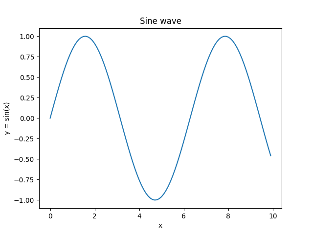
Example: simple plot
Consider the example below where plot() function is used to plot y = sin(x). After that, the axes functions are used to format the axes. At last, show() function is used to display the figure.
import matplotlib.pyplot as plt
import numpy as np

#creating an array of values between
#0 to 10 with a difference of 0.1
x = np.arange(0, 10, 0.1)
y = np.sin(x)

#plotting the curve
plt.plot(x, y)

#formatting axes
plt.xlabel("x")
plt.ylabel("y = sin(x)")
plt.title("Sine wave")

#displaying the figure
plt.show()
The output of the above code will be:
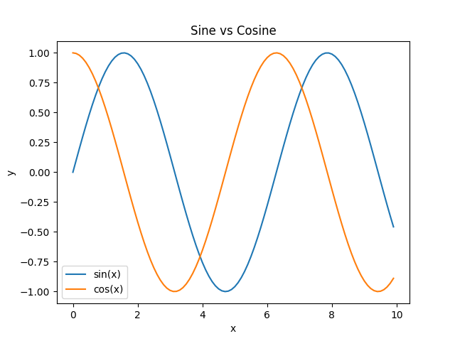
Example: adding legend
The example below shows how to add two plots in a single figure.
import matplotlib.pyplot as plt
import numpy as np

#creating an array of values between
#0 to 10 with a difference of 0.1
x = np.arange(0, 10, 0.1)
y1 = np.sin(x)
y2 = np.cos(x)

#plotting curves
plt.plot(x, y1)
plt.plot(x, y2)

#formatting axes
plt.xlabel("x")
plt.ylabel("y")
plt.title("Sine vs Cosine")

#adding legend
plt.legend(['sin(x)', 'cos(x)'])

#displaying the figure
plt.show()
The output of the above code will be:
Format String
A format string consists of a part for color, marker and line:
fmt = '[marker][line][color]'
Each of them is optional. If not provided, the value from the style cycle is used. Other combinations such as [color][marker][line] are also supported, but note that their parsing may be ambiguous.
A format string can be added to a plot to add more styles in it.
Markers
| Character | Description |
|---|---|
| '.' | point marker |
| ',' | pixel marker |
| 'o' | circle marker |
| 'v' | triangle_down marker |
| '^' | triangle_up marker |
| '<' | triangle_left marker |
| '>' | triangle_right marker |
| '1' | tri_down marker |
| '2' | tri_up marker |
| '3' | tri_left marker |
| '4' | tri_right marker |
| '8' | octagon marker |
| 's' | square marker |
| 'p' | pentagon marker |
| 'P' | plus (filled) marker |
| '*' | star marker |
| 'h' | hexagon1 marker |
| 'H' | hexagon2 marker |
| '+' | plus marker |
| 'x' | x marker |
| 'X' | x (filled) marker |
| 'D' | diamond marker |
| 'd' | thin_diamond marker |
| '|' | vline marker |
| '_' | hline marker |
Line styles
| Character | Description |
|---|---|
| '-' | solid line style |
| '--' | dashed line style |
| '-.' | dash-dot line style |
| ':' | dotted line style |
Colors
| Character | Description |
|---|---|
| 'b' | blue |
| 'g' | green |
| 'r' | red |
| 'c' | cyan |
| 'm' | magenta |
| 'y' | yellow |
| 'k' | black |
| 'w' | white |
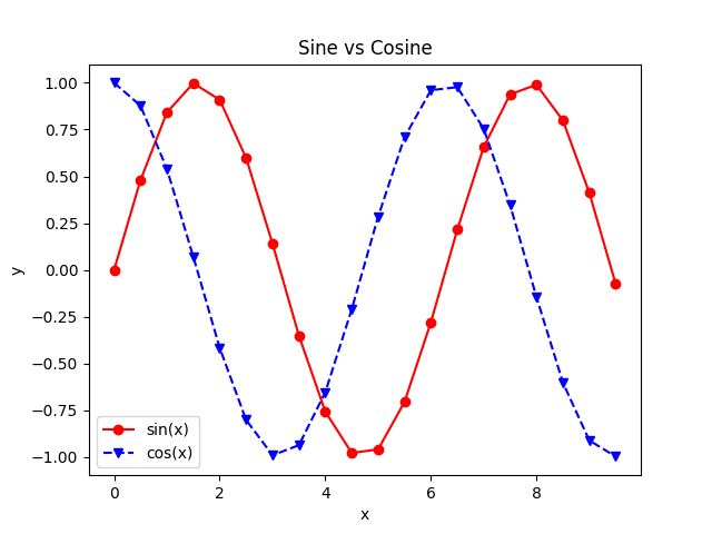
Example: using format string
In the example below, format string is used to add more styles in the plot.
import matplotlib.pyplot as plt
import numpy as np

#creating an array of values between
#0 to 10 with a difference of 0.5
x = np.arange(0, 10, 0.5)
y1 = np.sin(x)
y2 = np.cos(x)

#plotting curves
plt.plot(x, y1, 'o-r')
plt.plot(x, y2, 'v--b')

#formatting axes
plt.xlabel("x")
plt.ylabel("y")
plt.title("Sine vs Cosine")

#adding legend
plt.legend(['sin(x)', 'cos(x)'])

#displaying the figure
plt.show()
The output of the above code will be: