Matplotlib - 3D Scatter Plot
When projection='3d' keyword is passed to the axes creation routine, it creates three-dimensional axes. After creating 3D axes, matplotlib.Axes3D.scatter() function is used to draw scatter plot.
Syntax
matplotlib.Axes3D.scatter(x, y, z=0, s=None, c=None, marker=None)
Parameters
x |
Required. Specify the data positions. float or array-like, shape (n, ). |
y |
Required. Specify the data positions. float or array-like, shape (n, ). |
z |
Optional. Specify the data positions. Either an array of the same length as x and y or a single value to place all points in the same plane. |
s |
Optional. Specify the marker size in points**2. float or array-like, shape (n, ). |
c |
Optional. Specify array-like or list of colors or color. |
marker |
Optional. Specify the marker style. Default is 'o'. |
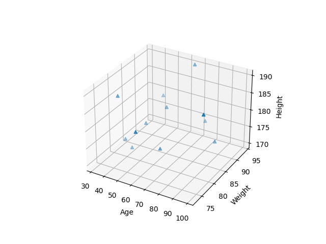
Example: 3D scatter plot
In the example below, the scatter() function is used to create scatter plot of 12 peoples of different age, weight and height.
import matplotlib.pyplot as plt
import numpy as np

#creating age, weight and height dataset
age = [40, 45, 32, 89, 65, 55, 35, 61, 75, 99, 65, 45]
weight = [82, 92, 81, 89, 94, 88, 82, 73, 93, 78, 80, 85]
height = [170, 180, 185, 173, 190, 180,
          172, 183, 175, 189, 174, 176]

fig = plt.figure()
ax = fig.add_subplot(111, projection='3d')
ax.set_xlabel('Age')
ax.set_ylabel('Weight')
ax.set_zlabel('Height')

#drawing scatter plot
ax.scatter(age, weight, height, marker="^")

plt.show()
The output of the above code will be:
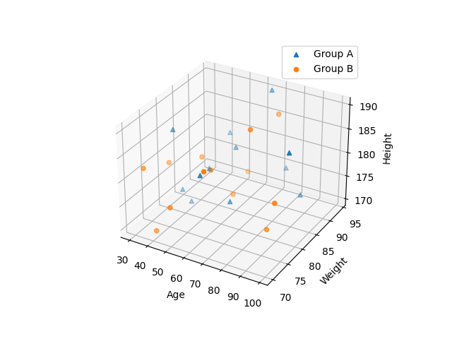
Example: compare plots
The scatter plot can be used to compare results of different datasets. Please consider the example below.
import matplotlib.pyplot as plt
import numpy as np

fig = plt.figure()
ax = fig.add_subplot(111, projection='3d')
ax.set_xlabel('Age')
ax.set_ylabel('Weight')
ax.set_zlabel('Height')

#Group A - 12 people
#creating age, weight and height dataset
age1 = [40, 45, 32, 89, 65, 55, 35, 61, 75, 99, 65, 45]
weight1 = [82, 92, 81, 89, 94, 88, 82, 73, 93, 78, 80, 85]
height1 = [170, 180, 185, 173, 190, 180,
          172, 183, 175, 189, 174, 176]

#drawing scatter plot for Group A
ax.scatter(age1, weight1, height1, marker="^")

#Group B - 13 people
#creating age, weight and height dataset
age2 = [42, 48, 35, 65, 75, 58, 30, 65, 71, 92, 63, 48, 88]
weight2 = [70, 81, 78, 81, 90, 78, 73, 86, 83, 78, 73, 71, 78]
height2 = [171, 181, 180, 175, 188, 181, 181,
          177, 188, 178, 184, 176, 172]

#drawing scatter plot for Group B
ax.scatter(age2, weight2, height2, marker="o")

ax.legend(["Group A", "Group B"])
plt.show()
The output of the above code will be: