Matplotlib - Stack Plot
A stack plot displays the complete data with visualization of how each part makes up the whole. Each constituent of the stack plot is stacked on top of each other.
The matplotlib.pyplot.stackplot() function draws a stacked area plot.
Syntax
matplotlib.pyplot.stackplot(x, y, baseline='zero'
                            labels=(), colors=None)
Parameters
x |
Required. Specify (N,) array-like. |
y |
Required. Specify (M, N) array-like. The data is assumed to be unstacked. Each of the following calls is allowed:#where y has shape (M, N) stackplot(x, y) #where y1, y2, y3 have length N stackplot(x, y1, y2, y3) |
baseline |
Optional. Specify method used to calculate the baseline:
|
labels |
Optional. Specify a sequence of labels to assign to each data series. |
colors |
Optional. Specify a sequence of colors to be cycled through and used to color the stacked areas. If not specified, the colors from the Axes property cycle will be used. |
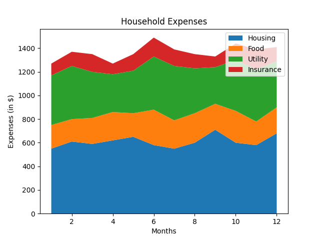
Example: stack plot
In the example below, a stack plot of household expenditure of 12 months is drawn.
import matplotlib.pyplot as plt
import numpy as np

months= [x for x in range(1,13)]

#creating data set
Housing = [550, 610, 590, 620, 650, 580,
           550, 600, 710, 600, 580, 680]
Food = [200, 190, 220, 240, 200, 300,
        240, 250, 220, 270, 200, 220]
Utility = [420, 450, 390, 320, 360, 450,
           460, 380, 310, 430, 440, 390]
Insurance = [100, 120, 150, 90, 140, 160,
             140, 120, 90, 140, 170, 120]
expenses = [Housing, Food, Utility, Insurance]

fig, ax = plt.subplots()
ax.set_title("Household Expenses")
ax.set_xlabel("Months")
ax.set_ylabel("Expenses (in $)")

#drawing stack plot
ax.stackplot(months, expenses)
ax.legend(["Housing", "Food", "Utility", "Insurance"])

plt.show()
The output of the above code will be:
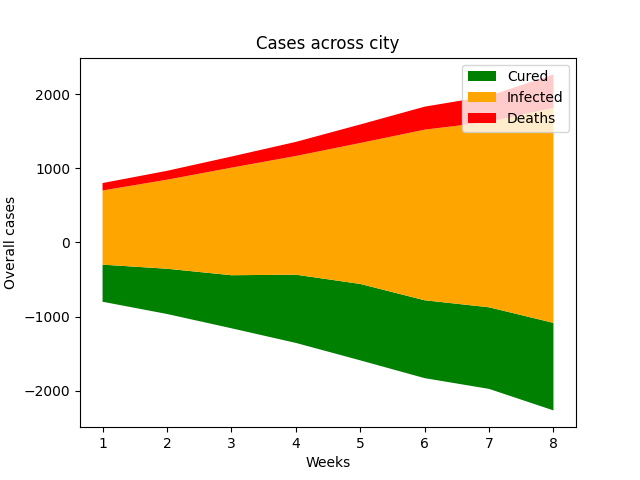
Example: symmetrical stack plot
When baseline="sym" is used, it creates a symmetrical stack plot around zero as shown in the example.
import matplotlib.pyplot as plt
import numpy as np

weeks= [x for x in range(1,9)]

#creating data set
Cured = [500, 610, 715, 920,
         1030, 1050, 1100, 1180]
Infected = [1000, 1200, 1450, 1600,
            1900, 2300, 2500, 2900]
Deaths = [100, 120, 150, 190,
          250, 310, 350, 450]
expenses = [Cured, Infected, Deaths]

fig, ax = plt.subplots()
ax.set_title("Cases across city")
ax.set_xlabel("Weeks")
ax.set_ylabel("Overall cases")

#drawing stack plot
col = ['green', 'orange', 'red']
ax.stackplot(weeks, expenses, colors=col, baseline="sym")
ax.legend(["Cured", "Infected", "Deaths"])

plt.show()
The output of the above code will be: