Matplotlib - Pie Chart
A pie chart (or a circle chart) is a circular statistical graphic, which is divided into slices to illustrate numerical proportion. In a pie chart, the area of each slice is proportional to the quantity it represents.
The matplotlib.pyplot.pie() function makes a pie chart of array x. The fractional area of each wedge is given by x/sum(x). If sum(x) < 1, then the values of x give the fractional area directly and the array will not be normalized. The resulting pie will have an empty wedge of size 1 - sum(x).
The wedges are plotted counterclockwise, by default starting from the x-axis.
The pie chart looks best if the figure and Axes are square, or the Axes aspect is equal.
Syntax
matplotlib.pyplot.pie(x, labels=None, colors=None,
                      autopct=None, radius=1, shadow=False)
Parameters
x |
Required. Specify 1D array-like. The wedge sizes. |
labels |
Optional. Specify a sequence of strings providing the labels for each wedge. Default is None. |
color |
Optional. Specify a sequence of colors through which the pie chart will cycle. If None, will use the colors in the currently active cycle. |
autopct |
Optional. If not None, it is a string or function used to label the wedges with their numeric value. The label will be placed inside the wedge. If it is a format string, the label will be fmt % pct. If it is a function, it will be called. |
radius |
Optional. Specify the radius of the pie. Default is 1. |
shadow |
Optional. If True, draws a shadow beneath the pie. |
Example: pie chart
In the example below, the pie() function is used to create a pie chart of the given dataset.
import matplotlib.pyplot as plt
import numpy as np

#creating dataset
students = [50, 40, 90, 30, 60, 50]
#creating labels
langs = ["Java", "C#", "Python", "PHP", "C++", "C"]

#drawing pie chart
plt.pie(students, labels=langs)
#To ensure axes aspect is equal
plt.axis("equal")

plt.show()
The output of the above code will be:

Example: displaying percentage inside wedge
By using autopct parameter, percentage is displayed inside the respective wedge as shown in the example.
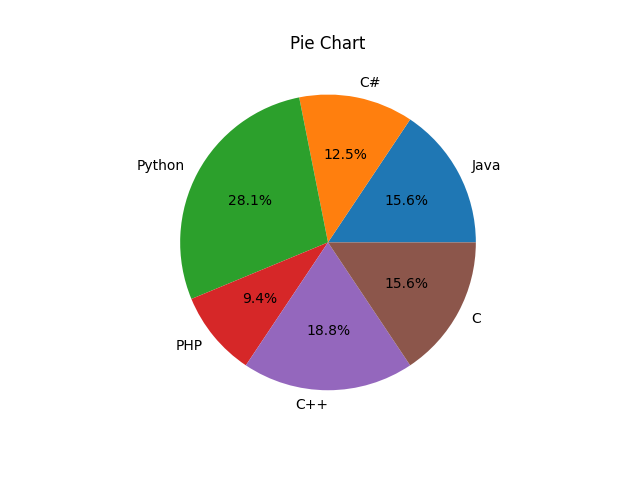
import matplotlib.pyplot as plt
import numpy as np

#creating dataset
students = [50, 40, 90, 30, 60, 50]
#creating labels
langs = ["Java", "C#", "Python", "PHP", "C++", "C"]

fig, ax = plt.subplots()
ax.set_title("Pie Chart")

#drawing pie chart
ax.pie(students, labels=langs, autopct='%1.1f%%')
#To ensure axes aspect is equal
ax.set_aspect("equal")

plt.show()
The output of the above code will be:
Example: adding legends
To add legends to the figure, the legend() function can be used.
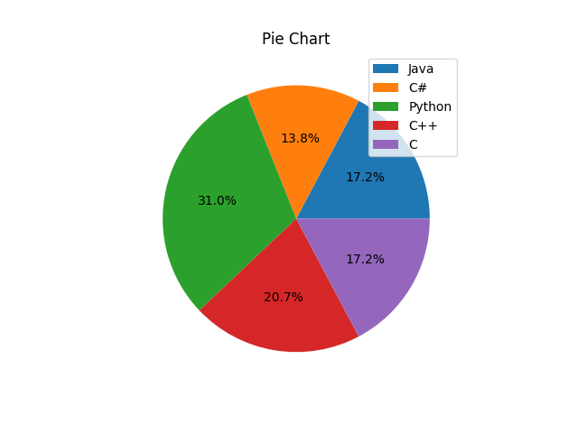
import matplotlib.pyplot as plt
import numpy as np

#creating dataset
students = [50, 40, 90, 60, 50]
#creating labels
langs = ["Java", "C#", "Python", "C++", "C"]

fig, ax = plt.subplots()
ax.set_title("Pie Chart")

#drawing pie chart
ax.pie(students, autopct='%1.1f%%')
#To ensure axes aspect is equal
ax.set_aspect("equal")

#adding legend
ax.legend(labels=langs, loc=1)

plt.show()
The output of the above code will be: