Matplotlib - Violin Plot
A violin plot is a method of plotting numeric data. It is similar to box plots, except that they also show the probability density of the data at different values.
The matplotlib.pyplot.violinplot() function makes a violin plot for each column of dataset or each vector in sequence dataset. Each filled area extends to represent the entire data range, with optional lines at the mean, the median, the minimum, the maximum, and user-specified quantiles.
Syntax
matplotlib.pyplot.violinplot(dataset, vert=None,
                             showmeans=False,
                             showmedians=False,
                             showextrema=True,
                             quantiles=None)
Parameters
dataset |
Required. Specify the input data as array or a sequence of vectors. |
vert |
Optional. If True (default), makes a vertical violin plot. Otherwise, creates a horizontal violin plot. |
showmeans |
Optional. If True, will toggle rendering of the means. Default is False. |
showmedians |
Optional. If True, will toggle rendering of the medians. Default is False. |
showextrema |
Optional. If True, will toggle rendering of the extrema. Default is True. |
quantiles |
Optional. If not None, set a list of floats in interval [0, 1] for each violin, which stands for the quantiles that will be rendered for that violin. |
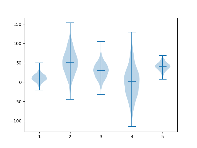
Example: violin plot
In the example below, the five randomly distributed datasets are created using numpy. Each sample contains 1000 records but different mean and standard deviation. Using these datasets, a violin plot is drawn.
import matplotlib.pyplot as plt
import numpy as np

np.random.seed(1)

#creating dataset
data1 = np.random.normal(10, 10, 1000)
data2 = np.random.normal(50, 30, 1000)
data3 = np.random.normal(30, 20, 1000)
data4 = np.random.normal(0, 40, 1000)
data5 = np.random.normal(40, 10, 1000)
data = [data1, data2, data3, data4, data5]

fig, ax = plt.subplots()

#drawing violin plot
ax.violinplot(data, showmedians=True)

plt.show()
The output of the above code will be:
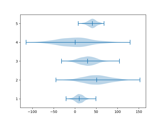
Example: horizontal violin plot
By using vert parameter, a horizontal violin plot can be created as shown in the example.
import matplotlib.pyplot as plt
import numpy as np

np.random.seed(1)

#creating dataset
data1 = np.random.normal(10, 10, 1000)
data2 = np.random.normal(50, 30, 1000)
data3 = np.random.normal(30, 20, 1000)
data4 = np.random.normal(0, 40, 1000)
data5 = np.random.normal(40, 10, 1000)
data = [data1, data2, data3, data4, data5]

fig, ax = plt.subplots()

#drawing violin plot
ax.violinplot(data, vert=False, showmedians=True)

plt.show()
The output of the above code will be: