Matplotlib - Bar Plot
A bar plot (or bar chart) is a graph that presents categorical data with rectangular bars with heights or lengths proportional to the values that they represent. The bars can be plotted vertically or horizontally.
The matplotlib.pyplot.bar() functions makes a bar plot. The bars are positioned at x with the given alignment. Their dimensions are given by height and width. The vertical baseline is bottom (default 0). Many parameters can take either a single value applying to all bars or a sequence of values, one for each bar.
Syntax
matplotlib.pyplot.bar(x, height, width=0.8,
                   bottom=None, align='center')
Parameters
x |
Required. Specify the x coordinates of the bars. float or array-like. |
height |
Required. Specify the heights of the bars. float or array-like. |
width |
Optional. Specify the widths of the bars. float or array-like. Default is 0.8. |
bottom |
Optional. Specify the y coordinates of the bars bases. float or array-like. Default is 0. |
align |
Optional. Specify the alignment of the bars to the x coordinates. Default is 'center'. To align the bars on the right edge pass a negative width and align='edge'.
|
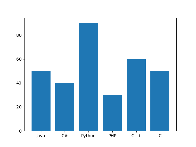
Example: bar plot
In the example below, a bar plot is drawn on a dataset containing information about number of student studying different languages.
import matplotlib.pyplot as plt
import numpy as np

#creating dataset
langs = ["Java", "C#", "Python", "PHP", "C++", "C"]
students = [50, 40, 90, 30, 60, 50]

fig, ax = plt.subplots()

#creating bar plot
ax.bar(langs, students)

plt.show()
The output of the above code will be:
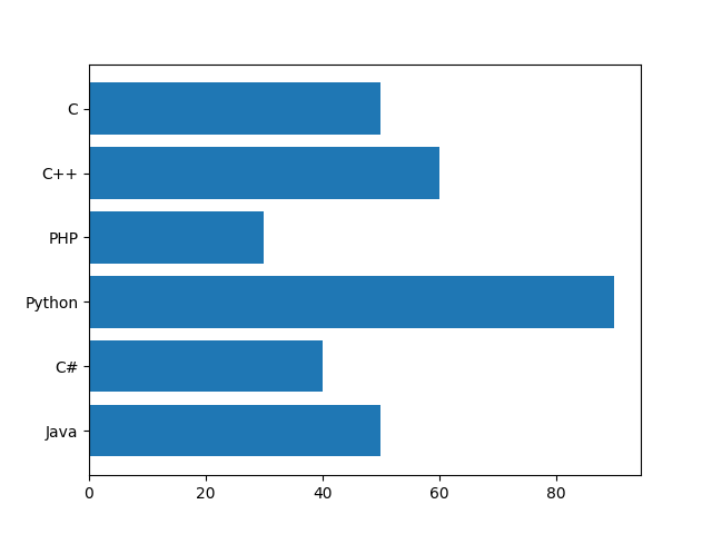
Example: horizontal bar plot
To draw a horizontal bar plot matplotlib.pyplot.barh() can be used which has same functionality as matplotlib.pyplot.bar(). Please consider the example below.
import matplotlib.pyplot as plt
import numpy as np

#creating dataset
langs = ["Java", "C#", "Python", "PHP", "C++", "C"]
students = [50, 40, 90, 30, 60, 50]

fig, ax = plt.subplots()

#creating horizontal bar plot
ax.barh(langs, students)

plt.show()
The output of the above code will be:
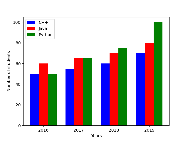
Example: multiple bar plot
Multiple bar plot is drawn by controlling the thickness and the positions of the bars. In the example below, data of number of students studying three different languages for last four years is created. To draw the bar plot of this data, the width of the bar is set to 0.25 units and each bar is shifted 0.25 units from the previous one.
import matplotlib.pyplot as plt
import numpy as np

#creating dataset
X = np.arange(4)
X_label = ['2016', '2017', '2018', '2019']
st_cpp = [50, 55, 60, 70]
st_java = [60, 65, 70, 80]
st_python = [50, 65, 75, 100]
students = [st_cpp, st_java, st_python]

fig, ax = plt.subplots()

#creating bar plot
ax.bar(X - 0.25, students[0], color = 'b', width = 0.25)
ax.bar(X, students[1], color = 'r', width = 0.25)
ax.bar(X + 0.25, students[2], color = 'g', width = 0.25)

#formatting axes
ax.set_ylabel("Number of students")
ax.set_xlabel("Years")
ax.set_xticks(X)
ax.set_xticklabels(X_label)
ax.legend(["C++", "Java", "Python"])

plt.show()
The output of the above code will be:
Example: stacked bar plot
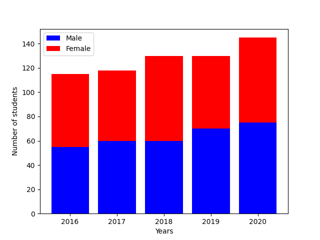
Stacked bar plot is drawn by controlling the bottom position of the bars. In the example below, data of male and female students for last five years is created. To draw the stacked bar plot of this data, the bottom of second bar plot is set to the height of the first bar plot.
import matplotlib.pyplot as plt
import numpy as np

#creating dataset
X = ['2016', '2017', '2018', '2019', '2020']
st_male = [55, 60, 60, 70, 75]
st_female = [60, 58, 70, 60, 70]
students = [st_male, st_female]

fig, ax = plt.subplots()

#creating bar plot
ax.bar(X, students[0], color = 'b')
ax.bar(X, students[1], color = 'r', bottom = students[0])

#formatting axes
ax.set_ylabel("Number of students")
ax.set_xlabel("Years")
ax.legend(["Male", "Female"])

plt.show()
The output of the above code will be:
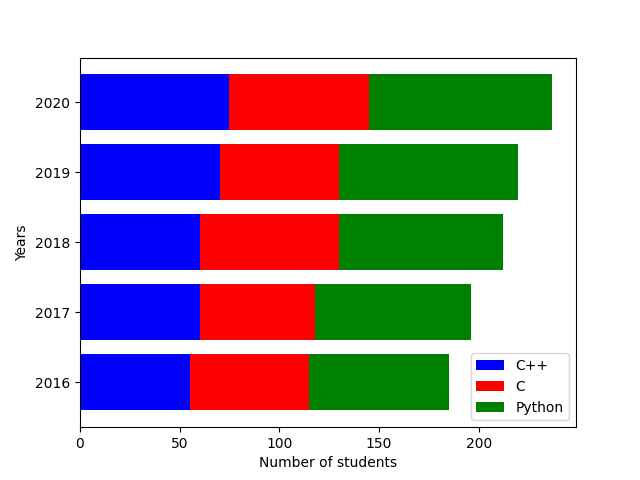
Example: stacked horizontal bar plot
Stacked horizontal bar plot is drawn by controlling the left position of the bars. In the example below, data of students studying three different languages is created for last five years. To draw the stacked horizontal bar plot of this data, the left of second bar plot is set to the length of the first bar plot. Similarly, the left of third bar plot is set to the sum of length of the first and second bar plots.
Please note that left parameter of barh() function has similar functionality as bottom parameter of bar() function.
import matplotlib.pyplot as plt
import numpy as np

#creating dataset
X = ['2016', '2017', '2018', '2019', '2020']
CPP = [55, 60, 60, 70, 75]
C = [60, 58, 70, 60, 70]
Python = [70, 78, 82, 90, 92]
langs = [CPP, C, Python]

fig, ax = plt.subplots()

#creating horizontal bar plot
ax.barh(X, langs[0], color = 'b')
ax.barh(X, langs[1], color = 'r', left = langs[0])
ax.barh(X, langs[2], color = 'g', left = np.add(langs[0], langs[1]))

#formatting axes
ax.set_ylabel("Years")
ax.set_xlabel("Number of students")
ax.legend(["C++", "C", "Python"])

plt.show()
The output of the above code will be: