Matplotlib - Grids
There are instances when we need grid lines in a plot. In Matplotlib, the Axes.grid() function can be used to configure grid lines for a given plot.
Syntax
#configure grid lines
Axes.grid(self, b=None, which='major',
          axis='both', **kwargs)
Parameters
b |
Optional. Specify boolean to show the grid lines. If any parameter is supplied, b will be set to True. |
which |
Optional. Specify the grid lines to apply the changes on. It can value from {'major', 'minor', 'both'}. |
axis |
Optional. Specify the axis to apply the changes on. It can value from {'both', 'x', 'y'}. |
**kwargs |
Optional. Define the line properties of the grid. |
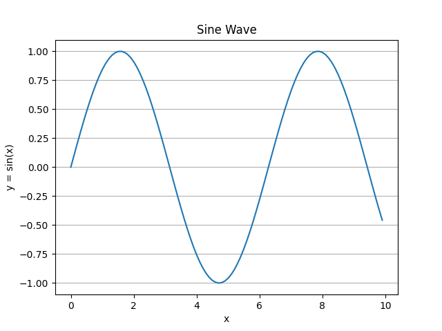
Example: showing axis grid
In the example below, only y-axis grid is enabled.
import matplotlib.pyplot as plt
import numpy as np
import math

#creating an array of values between
#0 to 10 with a difference of 0.1
x = np.arange(0, 10, 0.1)
y = np.sin(x)

fig, ax = plt.subplots()

#plotting curves
ax.plot(x, y)

#formatting axes
ax.set_title("Sine Wave")
ax.set_xlabel("x")
ax.set_ylabel("y = sin(x)")

#show y-axis grid lines
ax.grid(axis='y')

#displaying the figure
plt.show()
The output of the above code will be:
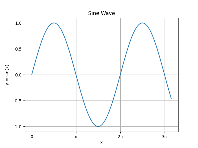
Example: using customized ticks and tick labels with grid
In the example below, first user-defined ticks and tick labels are used. Then the grid lines are shown according to the defined major ticks.
import matplotlib.pyplot as plt
import numpy as np
import math

#creating an array of values between
#0 to 10 with a difference of 0.1
x = np.arange(0, 10, 0.1)
y = np.sin(x)

fig, ax = plt.subplots()

#plotting curves
ax.plot(x, y)

#formatting axes
ax.set_title("Sine Wave")
ax.set_xlabel("x")
ax.set_ylabel("y = sin(x)")

#setting ticks and tick labels
pi = math.pi
ax.set_xticks([0, pi, 2*pi, 3*pi])
ax.set_xticklabels(['0', 'π', '2π', '3π'])
ax.set_yticks([-1, -0.5, 0, 0.5, 1])

#show both grid lines
ax.grid(axis='both')

#displaying the figure
plt.show()
The output of the above code will be:
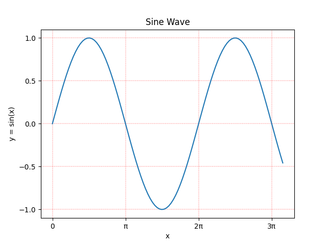
Example: line properties of the grid
We can set the line property of the grid. Consider the example below:
import matplotlib.pyplot as plt
import numpy as np
import math

#creating an array of values between
#0 to 10 with a difference of 0.1
x = np.arange(0, 10, 0.1)
y = np.sin(x)

fig, ax = plt.subplots()

#plotting curves
ax.plot(x, y)

#formatting axes
ax.set_title("Sine Wave")
ax.set_xlabel("x")
ax.set_ylabel("y = sin(x)")

#setting ticks and tick labels
pi = math.pi
ax.set_xticks([0, pi, 2*pi, 3*pi])
ax.set_xticklabels(['0', 'π', '2π', '3π'])
ax.set_yticks([-1, -0.5, 0, 0.5, 1])

#show both grid lines
ax.grid(axis='both')

#setting the line property of the grid
ax.grid(color='r', ls = '-.', lw = 0.25)

#displaying the figure
plt.show()
The output of the above code will be: