Matplotlib - Scatter Plot
A scatter plot is a type of plot which uses Cartesian coordinates to display values for typically two variables for a set of data. One additional variable can be added as color or shape or size of the marker. The data are displayed as a collection of points, each having the value of one variable determining the position on the horizontal axis and the value of the other variable determining the position on the vertical axis.
The matplotlib.pyplot.scatter() function makes scatter plot of y vs. x with varying marker size and/or color.
Syntax
matplotlib.pyplot.scatter(x, y, s=None, c=None, marker=None)
Parameters
x |
Required. Specify the data positions. float or array-like, shape (n, ). |
y |
Required. Specify the data positions. float or array-like, shape (n, ). |
s |
Optional. Specify the marker size in points**2. float or array-like, shape (n, ). |
c |
Optional. Specify array-like or list of colors or color. |
marker |
Optional. Specify the marker style. Default is 'o'. |
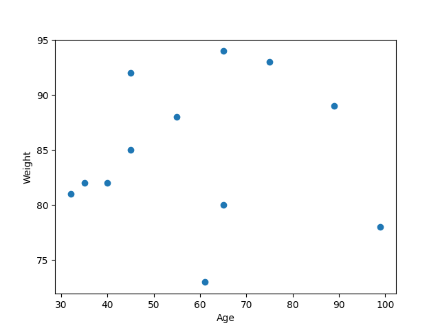
Example: scatter plot
In the example below, the scatter() function is used to create scatter plot of 12 peoples of different age and weight.
import matplotlib.pyplot as plt
import numpy as np

#creating age and weight dataset
age = [40, 45, 32, 89, 65, 55, 35, 61, 75, 99, 65, 45]
weight = [82, 92, 81, 89, 94, 88, 82, 73, 93, 78, 80, 85]

fig, ax = plt.subplots()
ax.set_xlabel('Age')
ax.set_ylabel('Weight')

#drawing scatter plot
ax.scatter(age, weight)

plt.show()
The output of the above code will be:
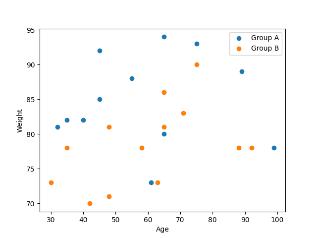
Example: compare plots
The scatter plot can be used to compare results of different datasets. Please consider the example below.
import matplotlib.pyplot as plt
import numpy as np

fig, ax = plt.subplots()
ax.set_xlabel('Age')
ax.set_ylabel('Weight')

#Group A - 12 people
#creating age and weight dataset
age1 = [40, 45, 32, 89, 65, 55, 35, 61, 75, 99, 65, 45]
weight1 = [82, 92, 81, 89, 94, 88, 82, 73, 93, 78, 80, 85]

#drawing scatter plot for Group A
ax.scatter(age1, weight1)

#Group B - 13 people
#creating age and weight dataset
age2 = [42, 48, 35, 65, 75, 58, 30, 65, 71, 92, 63, 48, 88]
weight2 = [70, 81, 78, 81, 90, 78, 73, 86, 83, 78, 73, 71, 78]

#drawing scatter plot for Group B
ax.scatter(age2, weight2)

ax.legend(["Group A", "Group B"])
plt.show()
The output of the above code will be: