Pandas DataFrame - plot.line() function
A line plot or line chart is a type of chart which displays information as a series of data points connected by straight line segments. It is similar to a scatter plot except that the measurement points are ordered (usually by x-axis value) and joined with straight line segments. A line plot is often used to visualize a trend in the data.
The DataFrame.plot.line() functions makes a line plot.
Syntax
DataFrame.plot.line(x=None, y=None, color)
Parameters
x |
Optional. Specify label or position. Allows plotting of one column versus another. If not specified, the index of the DataFrame is used. |
y |
Optional. Specify label or position. Allows plotting of one column versus another. If not specified, all numerical columns are used. |
colors |
Optional. Specify color for each of the DataFrame’s columns as str, array-like, or dict. Possible values are:
|
Return Value
Returns matplotlib.axes.Axes or an ndarray with one matplotlib.axes.Axes per column when subplots=True.
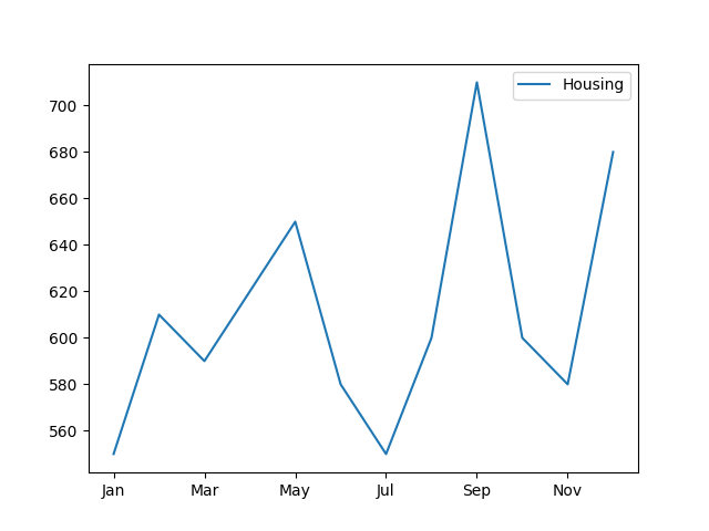
Example: line plot on single column
In the example below, a DataFrame Expenses is created. A line plot is created to study the data trend of Housing column.
import pandas as pd
import numpy as np
import matplotlib.pyplot as plt

Expenses = pd.DataFrame({
  "Housing": [550, 610, 590, 620, 650, 580,
              550, 600, 710, 600, 580, 680],
  "Food": [200, 190, 220, 240, 200, 300,
           240, 250, 220, 270, 200, 220],
  "Utility": [420, 450, 390, 320, 360, 450,
              460, 380, 310, 430, 440, 390],
  "Insurance": [100, 120, 150, 90, 140, 160,
                140, 120, 90, 140, 170, 120]},
  index= ["Jan", "Feb", "Mar", "Apr", "May", "Jun",
          "Jul", "Aug", "Sep", "Oct", "Nov", "Dec"]
)

#displaying the DataFrame
print(Expenses,"\n")
#creating the plot
Expenses.plot.line(y=['Housing'])

#displaying the plot
plt.show()
The output of the above code will be:
     Housing  Food  Utility  Insurance
Jan      550   200      420        100
Feb      610   190      450        120
Mar      590   220      390        150
Apr      620   240      320         90
May      650   200      360        140
Jun      580   300      450        160
Jul      550   240      460        140
Aug      600   250      380        120
Sep      710   220      310         90
Oct      600   270      430        140
Nov      580   200      440        170
Dec      680   220      390        120
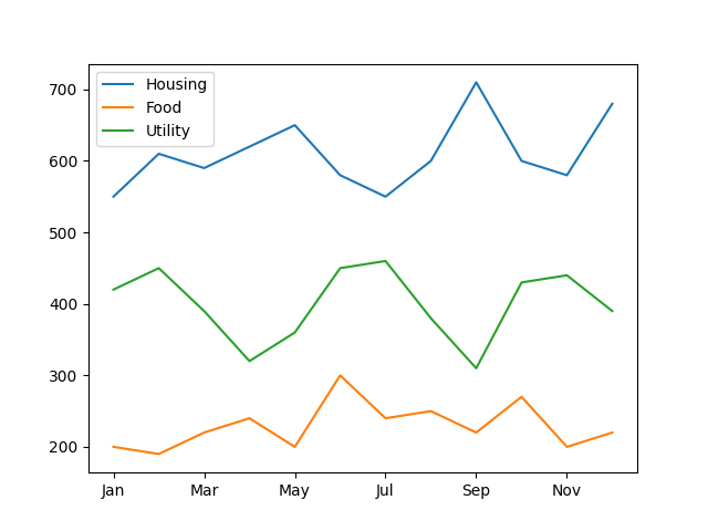
Example: line plot on multiple columns
In the example below the line plot is drawn for multiple columns.
import pandas as pd
import numpy as np
import matplotlib.pyplot as plt

Expenses = pd.DataFrame({
  "Housing": [550, 610, 590, 620, 650, 580,
              550, 600, 710, 600, 580, 680],
  "Food": [200, 190, 220, 240, 200, 300,
           240, 250, 220, 270, 200, 220],
  "Utility": [420, 450, 390, 320, 360, 450,
              460, 380, 310, 430, 440, 390],
  "Insurance": [100, 120, 150, 90, 140, 160,
                140, 120, 90, 140, 170, 120]},
  index= ["Jan", "Feb", "Mar", "Apr", "May", "Jun",
          "Jul", "Aug", "Sep", "Oct", "Nov", "Dec"]
)

#displaying the DataFrame
print(Expenses,"\n")
#creating the plot
Expenses.plot.line(y=['Housing', 'Food', 'Utility'])

#displaying the plot
plt.show()
The output of the above code will be:
     Housing  Food  Utility  Insurance
Jan      550   200      420        100
Feb      610   190      450        120
Mar      590   220      390        150
Apr      620   240      320         90
May      650   200      360        140
Jun      580   300      450        160
Jul      550   240      460        140
Aug      600   250      380        120
Sep      710   220      310         90
Oct      600   270      430        140
Nov      580   200      440        170
Dec      680   220      390        120
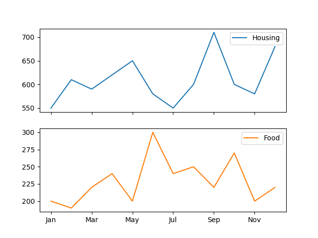
Example: Splitting the plot column wise
By using subplots=True parameter, we can split the plots column wise. Consider the example below:
import pandas as pd
import numpy as np
import matplotlib.pyplot as plt

Expenses = pd.DataFrame({
  "Housing": [550, 610, 590, 620, 650, 580,
              550, 600, 710, 600, 580, 680],
  "Food": [200, 190, 220, 240, 200, 300,
           240, 250, 220, 270, 200, 220],
  "Utility": [420, 450, 390, 320, 360, 450,
              460, 380, 310, 430, 440, 390],
  "Insurance": [100, 120, 150, 90, 140, 160,
                140, 120, 90, 140, 170, 120]},
  index= ["Jan", "Feb", "Mar", "Apr", "May", "Jun",
          "Jul", "Aug", "Sep", "Oct", "Nov", "Dec"]
)

#displaying the DataFrame
print(Expenses,"\n")
#creating the plot
Expenses.plot.line(y=['Housing', 'Food'],
                   subplots=True)

#displaying the plot
plt.show()
The output of the above code will be:
     Housing  Food  Utility  Insurance
Jan      550   200      420        100
Feb      610   190      450        120
Mar      590   220      390        150
Apr      620   240      320         90
May      650   200      360        140
Jun      580   300      450        160
Jul      550   240      460        140
Aug      600   250      380        120
Sep      710   220      310         90
Oct      600   270      430        140
Nov      580   200      440        170
Dec      680   220      390        120
❮ Pandas DataFrame - Functions
