R - Line Graph
A line graph or line chart is a type of chart which displays information as a series of data points connected by straight line segments. It is similar to a scatter plot except that the measurement points are ordered (usually by x-axis value) and joined with straight line segments. A line chart is often used to visualize a trend in the data.
The R plot() function makes a line graph of y vs x.
Syntax
plot(x, y, type, main, xlab,
     ylab, xlim, ylim, col)
Parameters
x |
Required. Specify the coordinates of points in the plot. Alternatively, a single plotting structure, function or any R object with a plot method can be provided. |
y |
Optional. Specify the y coordinates of points in the plot, optional if x is an appropriate structure. |
type |
Optional. Specify the type of the plot. Possible types are:
|
main, xlab, ylab |
Optional. Used to specify main title, x axis label and y axis label respectively. |
xlim, ylim |
Optional. Used to specify range of values on x-axis and y-axis respectively. |
col |
Optional. Used to specify colors for points. |
Example:
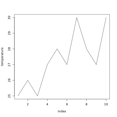
In the example below, the plot() function is used to create line chart of a dataset containing temperature of ten consecutive days.
#creating temperature dataset
temperature <- c(25, 26, 25, 27, 28,
                 27, 30, 28, 27, 30)

#naming the file
png(file = "linegraph.png")

#drawing the line graph
plot(temperature, type="l")

#saving the file
dev.off()
The output of the above code will be:
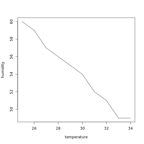
Example: Create y vs x graph
y vs x can be created as shown in the example below, where humidity is plotted against temperature for ten consecutive days.
#creating temperature dataset
temperature <- c(25, 26, 27, 28, 29,
                 30, 31, 32, 33, 34)
#creating humidity dataset
humidity <- c(60, 59, 57, 56, 55,
              54, 52, 51, 49, 49)

#naming the file
png(file = "linegraph.png")

#drawing the line graph
plot(temperature, humidity, type="l")

#saving the file
dev.off()
The output of the above code will be:
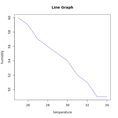
Example: Add features to a line chart
More features in the plot can be added using more parameters in the function, for example: to add title to the plot, main parameter is used and to add color, col parameter is used.
#creating temperature dataset
temperature <- c(25, 26, 27, 28, 29,
                 30, 31, 32, 33, 34)
#creating humidity dataset
humidity <- c(60, 59, 57, 56, 55,
              54, 52, 51, 49, 49)

#naming the file
png(file = "linegraph.png")

#drawing the line graph
plot(temperature, humidity, type="l",
     col="blue", main="Line Graph", )

#saving the file
dev.off()
The output of the above code will be:
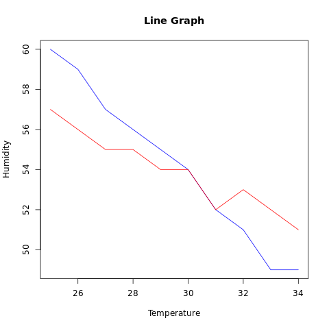
Multiple Lines in a Line Chart
More than one line can be plotted on the same chart by using the lines() function.
Example:
In the example below, line graphs for two data sets are plotted on the same chart.
#creating temperature and humidity dataset1
t1 <- c(25, 26, 27, 28, 29,
        30, 31, 32, 33, 34)
h1 <- c(60, 59, 57, 56, 55,
        54, 52, 51, 49, 49)

#creating temperature and humidity dataset2
t2 <- c(25, 26, 27, 28, 29,
        30, 31, 32, 33, 34)
h2 <- c(57, 56, 55, 55, 54,
        54, 52, 53, 52, 51)

#naming the file
png(file = "linegraph.png")

#drawing the line graph
plot(t1, h1, type="l",
     col="blue", main="Line Graph",
     xlab="Temperature", ylab="Humidity")

lines(t2, h2, type="l", col = "red")

#saving the file
dev.off()
The output of the above code will be: