R - Scatter Plot
A scatter plot is a type of plot which uses Cartesian coordinates to display values for typically two variables for a set of data. One additional variable can be added as color or shape or size of the marker. The data are displayed as a collection of points, each having the value of one variable determining the position on the horizontal axis and the value of the other variable determining the position on the vertical axis.
The R plot() function makes scatter plot of y vs. x.
Syntax
plot(x, y, main, xlab, ylab,
     xlim, ylim, col)
Parameters
x |
Required. Specify a vector of horizontal coordinates. |
y |
Optional. Specify a vector of vertical coordinates. |
main, xlab, ylab |
Optional. Used to specify main title, x axis label and y axis label respectively. |
xlim, ylim |
Optional. Used to specify range of values on x-axis and y-axis respectively. |
col |
Optional. Used to specify colors for points. |
Example:
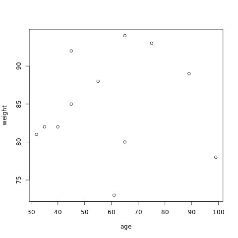
In the example below, the plot() function is used to create scatter plot of 12 peoples of different age and weight.
#creating age and weight dataset
age <- c(40, 45, 32, 89, 65, 55, 35, 61, 75, 99, 65, 45)
weight <- c(82, 92, 81, 89, 94, 88, 82, 73, 93, 78, 80, 85)

#naming the file
png(file = "scatterplot.png")

#drawing the scatterplot
plot(age, weight)

#saving the file
dev.off()
The output of the above code will be:
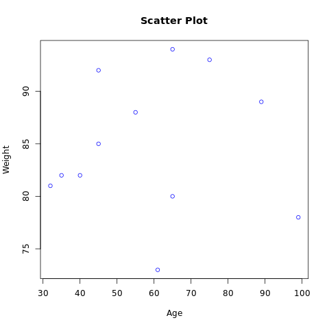
Example: Add features to a scatter plot
More features in the plot can be added using more parameters in the function, for example: to add title to the plot, main parameter is used and to add color, col parameter is used.
#creating age and weight dataset
age <- c(40, 45, 32, 89, 65, 55, 35, 61, 75, 99, 65, 45)
weight <- c(82, 92, 81, 89, 94, 88, 82, 73, 93, 78, 80, 85)

#naming the file
png(file = "scatterplot.png")

#drawing the scatterplot
plot(age, weight, main="Scatter Plot",
     col="blue", , xlab="Age", ylab="Weight")

#saving the file
dev.off()
The output of the above code will be:
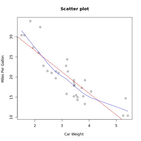
Example: Add fit lines
R gives the flexibility to add fit lines in the scatter plot. Consider the example below where mtcar database is used.
attach(mtcars)

#naming the file
png(file = "scatterplot.png")

plot(wt, mpg, main="Scatter plot",
   xlab="Car Weight ", ylab="Miles Per Gallon ")

# Add fit lines
# regression line (mpg~wt)
abline(lm(mpg~wt), col="red")

# lowess line (wt,mpg)
lines(lowess(wt,mpg), col="blue")

#saving the file
dev.off()
The output of the above code will be:
Scatterplot Matrices
When the database contains more than two variables and the correlation between each variable with respect to another variables are required, the scatterplot matrix can be used. The syntax for using pairs() function of scatterplot matrix is given below:
Syntax
pairs(formula, data, main)
Parameters
formula |
Required. Specify formula represents the series of variables used in pairs. |
data |
Required. Specify data represents the data set from which the variables will be taken. |
main |
Optional. Used to specify main title. |
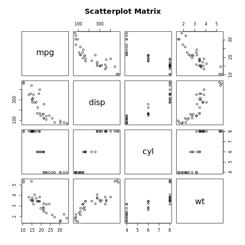
Example:
In the example below, mtcar database is used. The four variables of this database is used to create scatterplot matrices.
attach(mtcars)

#naming the file
png(file = "scatterplot matrix.png")

pairs(~mpg+disp+cyl+wt,data=mtcars,
   main="Scatterplot Matrix")

#saving the file
dev.off()
The output of the above code will be: