R - Pie Chart
A pie chart (or a circle chart) is a circular statistical graphic, which is divided into slices to illustrate numerical proportion. In a pie chart, the area of each slice is proportional to the quantity it represents.
The R pie() function makes a pie chart of vector x. The fractional area of each slice is given by x/sum(x). Slices are plotted counterclockwise, by default starting from the x-axis.
Syntax
pie(x, labels, radius, clockwise, main, col)
Parameters
x |
Required. Specify a vector of non-negative numerical quantities. The values in x are displayed as the areas of pie slices. |
labels |
Optional. Specify one or more expressions or character strings giving names for the slices. For empty or NA (after coercion to character) labels, no label nor pointing line is drawn. |
radius |
Optional. Specify the radius of the circle of the pie chart range from -1 to +1. |
clockwise |
Optional. Indicates if slices are drawn clockwise or counter clockwise. |
main |
Optional. Used to specify main title of the chart. |
col |
Optional. Specify a vector of colors to be used in filling or shading the slices. |
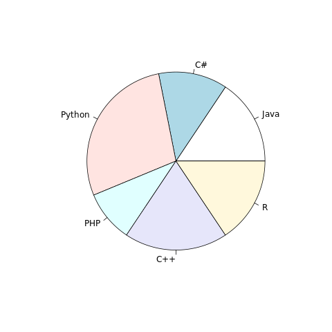
Example:
In the example below, a pie chart is created using data present in vector students, which represents number of students studying different languages.
#creating dataset
students <- c(50, 40, 90, 30, 60, 50)
#creating labels
langs <- c("Java", "C#", "Python", "PHP", "C++", "R")

#naming the file
png(file = "piechart.png")

#drawing the pie chart
pie(students, labels=langs)

#saving the file
dev.off()
The output of the above code will be:
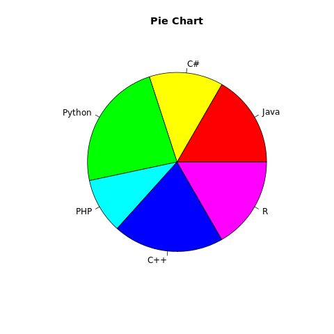
Example: Add features to pie chart
More features in the chart can be added using more parameters in the function, for example: to add title to the chart, main parameter is used and to add color, col parameter is used. A rainbow color pallet can be used to give different colors to each slice. The length of the pallet should be same as number of slices in the pie chart.
#creating dataset
students <- c(50, 40, 70, 30, 60, 50)
langs <- c("Java", "C#", "Python", "PHP", "C++", "R")

#naming the file
png(file = "piechart.png")

#drawing the pie chart
pie(students, labels=langs, main="Pie Chart",
        col=rainbow(length(langs)))

#saving the file
dev.off()
The output of the above code will be:
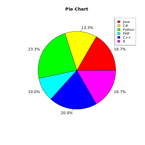
Example: Add percentages and legend to the chart
We can add percentages to each slice and legend to the chart. Consider the example below:
library(formattable)

#creating dataset
students <- c(50, 40, 70, 30, 60, 50)
slice_percentage <- percent(students/sum(students), 1)

langs <- c("Java", "C#", "Python", "PHP", "C++", "R")

#naming the file
png(file = "piechart.png")

#drawing the pie chart
pie(students, labels=slice_percentage, main="Pie Chart",
        col=rainbow(length(langs)))

#adding legend to the pie-chart
legend("topright", langs, cex = 0.9, fill = rainbow(length(langs)))

#saving the file
dev.off()
The output of the above code will be:
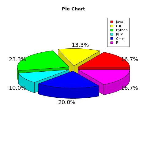
Example: 3D pie chart
To draw a 3D pie chart, pie3D() can be used.
library(formattable)
library(plotrix)

#creating dataset
students <- c(50, 40, 70, 30, 60, 50)
slice_percentage <- percent(students/sum(students), 1)

langs <- c("Java", "C#", "Python", "PHP", "C++", "R")

#naming the file
png(file = "piechart.png")

#drawing the pie chart
pie3D(students, labels=slice_percentage, main="Pie Chart",
        col=rainbow(length(langs)), explode=0.1)

#adding legend to the pie-chart
legend("topright", langs, cex = 0.9, fill = rainbow(length(langs)))

#saving the file
dev.off()
The output of the above code will be: